Showing posts with label H&M. Show all posts

Friday, December 5, 2014

Bright Lights

Store: H&M | Location: Oakbrook Center, Oak Brook, IL

This window from H&M that I saw over Thanksgiving break was definitely not to be missed. I honestly think it had the brightest lights out of all the stores at Oakbrook. It was that bright! I loved the outfits on these mannequins! All of them were very cozy and loads of layers, which was perfect for this cold season! 
In terms of the design principles, this window was sort of all over the place for me. It definitely had emphasis to catch people's attention from all the bright lights, but my only issue was that the mannequins were blocking the huge graphic behind them, so it was a bit distracting not being able to see the picture in full view. I think if that portion was just gold like the rest of it is, this window would've definitely felt complete. I also just noticed that on the right side of the window, there is some wording that is very difficult to read. I definitely think there could've been something done about that, but regardless of everything I've just said, I still think this was a great window because it grabs your attention immediately, which I think is what H&M was aiming to do.

Friday, November 7, 2014

Black and White

Store: H&M | Location: Yorktown Center, Lombard, IL

I have quite a few posts on displays from H&M, so if you couldn't tell, it's one of my favorite places to shop. I loved this display because of the black and white color scheme, so it automatically gets an A+ from me. I love that they alternated the black and white stands for the mannequins. It adds visual interest and makes your eyes travel, so there is definitely rhythm in this display. I also liked how the two big posters in the back contrasted each other and were opposites (one is white with the model wearing black, and vice versa). Like I said in the previous H&M post, the posters in this display also help to tie in the whole display and really emphasize the black and white theme.  
This display was very balanced and proportioned. You can't really tell since this picture was taken from an angle, but trust me, everything was perfectly centered and symmetrical when looked straight at it. My only criticism about this window is that it feels a bit cluttered because of the black and white squares on the bottom, but other than that, I think this display proved to be very successful and showcased the principles of design very well. 

Fall Fashion

Store: H&M | Location: Woodfield Mall, Schaumburg, IL

I love this display, but there are also a few things that I don't like about it. I'll start off with the positives. It's hard to tell in this picture, but I loved the color scheme of the outfits. The color palette consisted of black, olive green, and blush/ballerina pink. The woman in the huge poster on the left was also wearing olive green, so it really helped to tie the whole display together. I loved this display because it was fairly simple, but still impactful. The way the mannequins are aligned grabs your attention because they almost form a sort of mini army of mannequins. I think also since they are so close together, it makes the color scheme very clear (just wish you could actually see the colors better!)  
What I didn't like about this display was that it wasn't balanced. I'm all about perfect symmetry, so having the small "Fall Fashion" signage on the bottom right throws everything off. I did however just notice from looking at this picture that the backdrop behind the mannequins is further back than the poster with the woman, so it gives the display some depth. In terms of proportions, you can definitely tell that the window is very roomy, so I liked that they were able to fill it up but not make it look cluttered or crowded. As I've said in my previous posts about Zara, I like how they have some of the prices displayed in the window because it not only informs people that are passing by the window, but it also may push sales if those people choose to look for the item in the store.

Wednesday, October 1, 2014

Pastel Heaven

Store: H&M | Location: Yorktown Center, Lombard, IL

A new H&M recently opened near me at Yorktown Mall in Lombard and I was very impressed with all of the visual displays. This one really caught my eye, especially since it's not an actual window display, but it's just part of the wall. The theme is evident and it's very clear on what type of girl this display is trying to attract. It's feminine and filled with pastel shades and girly silhouettes.  
Product placement is what makes this display visually appealing and I love that they used the merchandise as props to enhance the display and didn't just rely on the two mannequins to do all the talking. The products are not only placed in a way that is shoppable to the customer, but they all work together into completing this display as a whole. Visual displays don't always have to be filled with actual objects and props, and this display is definitely a prime example. 
Since this display is enclosed in a square shape, it makes everything well proportioned and balanced. Everything is at the same height and is perfectly aligned and the weight is distributed evenly. Emphasis is brought to the display from all of the pastel shades, and because of all the fun colors your eyes are constantly traveling from one corner to the next. This display definitely worked well and all of the principles of design made it unified. 


Tuesday, September 30, 2014

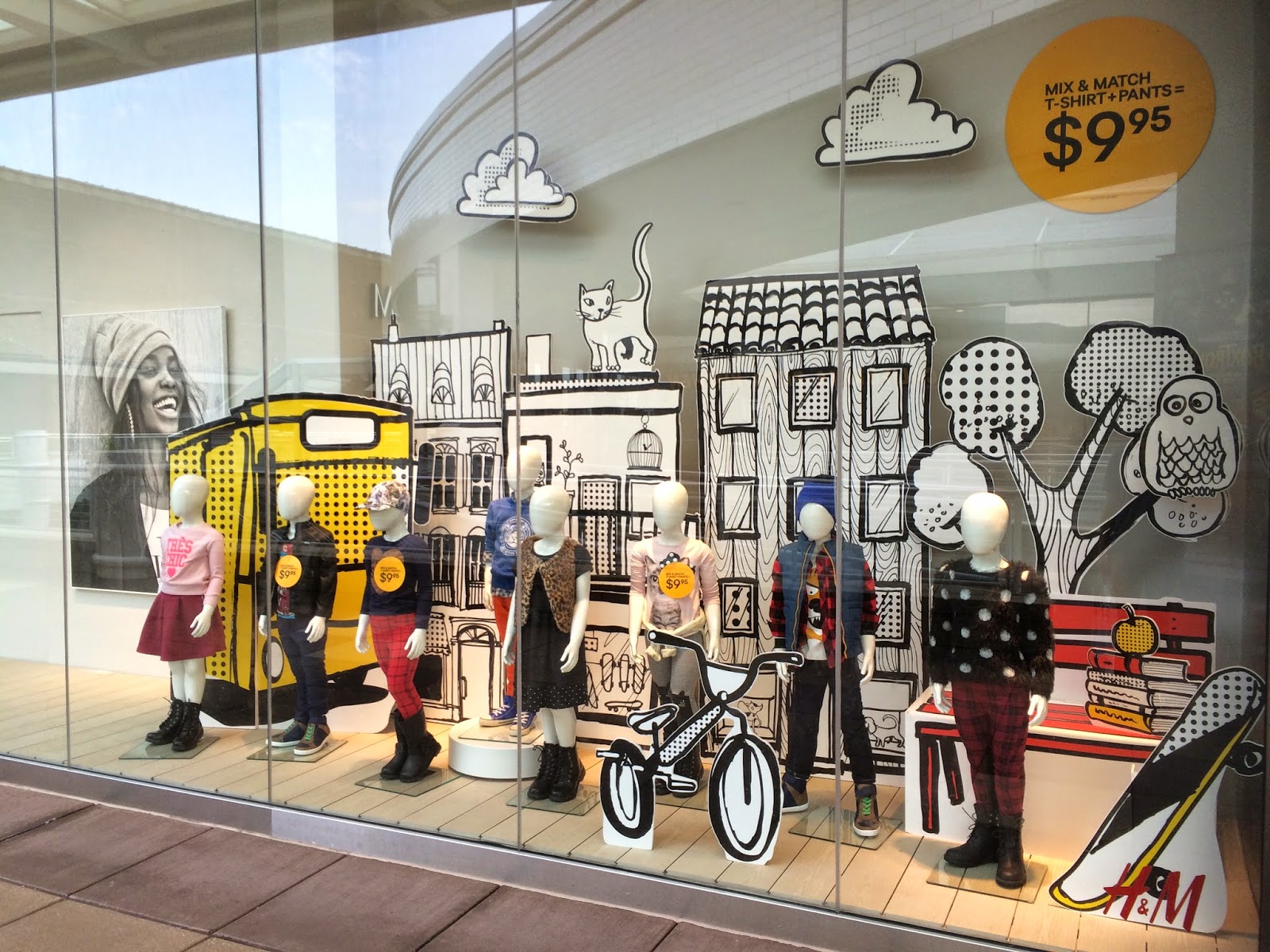
Cool Kid's Club

Store: H&M | Location: Oakbrook Center, Oak Brook, IL

This kid's window display from H&M was one of my favorites in terms of the graphics. Any signs, posters, or graphics used in windows can definitely set the mood for the whole display. This one was obviously geared towards a Back to School theme, which you can pick up on from the textbook and apple graphic on the right hand side, amongst other things like the skateboard, bicycle and tree. This display would definitely appeal to younger kids because it's bold and almost feels like it's a pop-up or coloring book. 
As far as the outfits, can we first just talk about how insanely cool clothes for kids are now? (Also refer to one of my previous posts on the kid's display from Zara). I mean, look at these outfits.. I did not dress like that when I was a kid. I think kid's fashion has definitely grown a lot since our days as kids. What I'm getting from this display is that kids should be well dressed too and retailers are pushing that idea. It kind of gets the youngsters to be concerned about their appearance or personal style started at an early age. Which could either be a good or bad thing.  
A lot is going on in this display, but you can definitely still pick up on what principles of design are being used. There are a lot of different proportions used with the graphics, which give the display a loud presence that immediately grabs your attention as you walk by. The window is filled with something in almost every corner so you soak in every last detail and are never looking at just nothing. Emphasis is put on the size of the graphics being used. 
This display definitely tells a story and is enticing enough for you, or someone's kid to want to go into the store.