Showing posts with label Window Displays. Show all posts

Friday, December 5, 2014

Black Fiveday

Store: Aritzia | Location: Oakbrook Center, Oak Brook, IL
Things have come full circle with my blog! Started off my first post about an Aritzia window display, and now I'm ending with my last post on another window by Aritzia! But I digress.. 
This window proved yet again that even the simplest concept/theme can still be very impactful. From far away, the silver parts that are hanging almost look like rain droplets (which I think is what they were going for?), so I was eager to get a closer look at the window. They definitely highlight the scale of this window and how large and proportionate it is. I will say though, the placement of the red Black Friday promotion confused me. I didn't like how some of them were covering the mannequins, and I also thought it was a bit repetitive to just plaster the same signs twice. I think two would've been fine and that way, they wouldn't have to cover the mannequins so much. I also think that having the branch lighting on only one side makes the window not as balanced or symmetrical. They should've added one to the other side! Overall though, this window to me was still really great and it showed that you don't always have to put out extravagant, flashy displays to draw people into your store. Simplicity is key is what I like to say!

Bright Lights

Store: H&M | Location: Oakbrook Center, Oak Brook, IL

This window from H&M that I saw over Thanksgiving break was definitely not to be missed. I honestly think it had the brightest lights out of all the stores at Oakbrook. It was that bright! I loved the outfits on these mannequins! All of them were very cozy and loads of layers, which was perfect for this cold season! 
In terms of the design principles, this window was sort of all over the place for me. It definitely had emphasis to catch people's attention from all the bright lights, but my only issue was that the mannequins were blocking the huge graphic behind them, so it was a bit distracting not being able to see the picture in full view. I think if that portion was just gold like the rest of it is, this window would've definitely felt complete. I also just noticed that on the right side of the window, there is some wording that is very difficult to read. I definitely think there could've been something done about that, but regardless of everything I've just said, I still think this was a great window because it grabs your attention immediately, which I think is what H&M was aiming to do.

A Bird Filled Holiday

Store: Anthropologie | Location: Oakbrook Center, Oak Brook, IL
When I went to Oakbrook Mall over Thanksgiving break, I couldn't wait to see what kind of window displays Anthropologie had because they always have really creative and fun windows. This window was no exception and did not disappoint my expectations. It's holiday themed without it being blatantly obvious. The two outfits compliment each other nicely and showcase the merchandise as well as who the Anthropologie customer is.  
This window definitely had a lot of emphasis and rhythm from the birdhouses and leaves arrangement. It's something that when you see it from far away, you want to get a closer look to see what it is. The differing mannequin heights, as well as how huge the bird houses and leaves arrangement are give the window proportion and depth, which ultimately unify this display.

Friday, November 28, 2014

A Pink Holiday

Store: Louis Vuitton | Location: Oakbrook Center, Oak Brook, IL
I was immediately drawn to this Louis Vuitton window because of the bright pink/magenta color. I was kind of scared to get a closer picture of the window though because someone was sitting right by the cash register, so this was as good a shot as I was willing to get! But I loved this window because despite it being the holidays and going for traditional holiday colors like green and red, they went with a completely different color that has very little to do with the holidays! If you look closely though, the pink and gold ribbons form a present shape around the purse that is being displayed, so it's still holiday themed in that sense! Pretty creative! 
This window definitely has a lot of emphasis from the bright colors, and flows nicely because of the shape/pattern that the ribbons are placed in. I think since there really is no rhyme or reason to the placement of anything else in this window, there isn't much to say about it being proportioned or balanced. But for a pretty small window, they worked with what they had and were still able to present a successful, eye catching display.

Joy to the Cozy

Store: Loft | Location: Oakbrook Center, Oak Brook, IL
This window was so fun! I loved the bright green and red gift boxes, as well as the snowy trees on both sides! I think this window did well in terms of the principles of design. The differing heights of the mannequins add some proportion, it's well balanced and flows nicely, and emphasis is put on the huge poster of sweaters that is in the middle of the window.  
What I didn't like about this display was the signage/wording. Just looking at this picture, you can barely even read the "Joy to the Cozy" wording. It actually took me awhile to figure out what it said just by zooming into the picture. I think it would've been better if they moved some of the wording on either sides of the windows where they have that blank space with just the bare wall showing.

Sky's the Limit

Store: Kate Spade | Location: Oakbrook Center, Oak Brook, IL
I loved these windows from Kate Spade. They're both fairly simple, but still grab your attention for different reasons. The first window is eye catching because of the little circles backdrop and the second window is so clean and bright from the cream colored walls. I think both windows do an excellent job of showcasing what kind of customer shops at Kate Spade; a fun, yet elegant woman.  
Since both windows aren't that complex and don't have much in them other than mannequins and product, there isn't really much to judge them on in terms of the principles of design. Both have emphasis though in highlighting the products they are trying to sell. The first window's emphasis comes from the backdrop, while the minimal approach in the second window is what is being emphasized.

Wednesday, November 26, 2014

One Square Will Do the Trick

Store: Tommy Hilfiger | Location: Chicago Premium Outlets, Aurora, IL
This display from Tommy Hilfiger definitely caught my attention from far away because I couldn't tell what it was so I had to get closer to it in order to see what it was all about. I thought this was such a clever way to display as much merchandise as possible without it looking like it was overkill, or cluttered. It definitely helps that everything is neatly placed and folded a certain way. And even though this square filled with product, plus the Black Friday signage are the only things in the entire window, it still makes such a huge impact on the people passing by it. I think if they were to add more to the window, it would just distract from the original emphasis of the display, which is the square of merchandise. 
In terms of the principles of design, there isn't much to base anything off of, but I will say that it's definitely proportioned, balanced, and has rhythm from looking at al the different products that are being displayed.

Colored Basics

Store: Ann Taylor Factory Store | Location: Chicago Premium Outlets, Aurora, IL

I loved this display because it was one of the few windows I saw and liked that wasn't holiday themed for once. Not that I don't like seeing holiday spirit in all of the window displays. I think it's just that since this wasn't really a holiday themed window, it caught my attention more.  
I think the use of colors in this display are what drew me to it. I love that they showcased basic sweaters in the variety of colors that they come in. I think this is smart advertising because customers are able to see what the store has to offer and that there is a little bit of something for everybody. Although this display is fairly simple, I think it still makes a really good first impression on what Ann Taylor is trying to showcase with their brand. You get different proportions with the two hanging bars and a bit of rhythm and emphasis from looking at all of the different colors of sweaters they have to offer.

Best Winter Ever

Store: J.Crew | Location: Chicago Premium Outlets, Aurora, IL
This was another window from J.Crew that I really liked. However, I think that the two sides are meant to be separate themes, so initially I was a bit confused as to how the right side tied in with the left side because I was looking at the window as a whole. I think it would've been helpful for them to put some sort of divider between the two, that way it would be easy to distinguish them as two different displays. 
But regardless, when you do look at them individually, they are both really great displays. I love that the kid's theme on the left has a giant snowman and snow, which help to give off a very playful vibe. The theme on the right side gave off a very home vibe, and I think that the lights that are wrapped around all the fixtures/stands really add an extra touch to the entire thing. Both themes were proportioned and had a clear emphasis. With both displays, neither the outfits or the props overpowered one another. Each display had just the right amount of everything.

Best Holiday Ever

Store: J.Crew | Location: Chicago Premium Outlets, Aurora, IL

This is one of the cutest holiday windows I've seen this season! The entire display just gives you a really cozy, home vibe and I can't help but think 'nothing beats being home for the holidays'! I think this display showcases J.Crew's aesthetic and lifestyle very well. The focus isn't just on the clothes; the display portrays an actual lifestyle and really shows who the J.Crew customer is, or who the customer wants to be.
Everything about this display was perfect and spot on (at least in my eyes!). From the socks hanging over the fireplace, to the outfits, this display is definitely going to grab your attention. It's proportioned, balanced, and has enough in it to keep your eyes traveling. I do think that they could've added some sort of rug or carpet though because the floor is a bit bare. But other than that, still a really great window. I personally think that the socks hanging over the fireplace are the emphasis of this window just because of how colorful they are. They're actually the first thing that grabbed my attention when I came upon this display, and so I was intrigued to get a closer look. I think I could honestly stare at this window all day. I thought it was that cute!

Sunday, November 23, 2014

A Green Christmas

Store: Zara | Location: Oakbrook Center, Oak Brook, IL

I'm so glad to be home for Thanksgiving break! I've only been home for two days but I've already managed to go to the mall! I was excited to see what Zara has done with their windows for the holidays and I was not disappointed when I saw this one! It's so magical and very holiday themed without it being so in your face and cliché, which is what I love about it! They played with different shades of green for the outfits, which I thought was new and refreshing because I never would have thought to pair dark green with pastel green. They definitely showed that it can be done well! 
In terms of the principles of design, I sort of feel that this display was all over the place. To me, it isn't very balanced and nothing is placed symmetrically. The two mannequins on the left are kind of just hangin' out in the corner over there, and I'm confused as to why they put the one mannequin behind the lights. I did however find that emphasis was brought to this display through the color scheme, as well as the fairy lights. The lights are definitely what made me want to stop and just stare at the windows! The placement of the Black Friday signage was a bit odd to me though because it was kind of difficult to read. But it was still smart of them to advertise that they would be having sales on Black Friday. Interestingly enough, my sister and I asked what their Black Friday deal/promotion was going to be and they told us that they aren't allowed to say. Talk about exclusive!

Sparkle, Shine, Celebrate

Store: Express | Location: Eastland Mall, Bloomington, IL
This display definitely caught my attention because of the big Christmas tree that's in it! Seeing it made me that much more excited for Christmas! 
I think this display definitely did a good job of promoting Express as a place to go for holiday outfit shopping. However, I just think that there's so much going on in one window that it's kind of overwhelming...and in a bad way. It just feels so cluttered with the tree, the sparkly boxes, the mannequins, and all of the different signage in one tiny window. I did think that it had rhythm though because you are constantly looking at every last corner of this display. I think if they had more space, this window definitely could have been executed a lot better. I still give it an A+ though just because it makes me happy for the holidays!

Friday, November 7, 2014

Black and White

Store: H&M | Location: Yorktown Center, Lombard, IL

I have quite a few posts on displays from H&M, so if you couldn't tell, it's one of my favorite places to shop. I loved this display because of the black and white color scheme, so it automatically gets an A+ from me. I love that they alternated the black and white stands for the mannequins. It adds visual interest and makes your eyes travel, so there is definitely rhythm in this display. I also liked how the two big posters in the back contrasted each other and were opposites (one is white with the model wearing black, and vice versa). Like I said in the previous H&M post, the posters in this display also help to tie in the whole display and really emphasize the black and white theme.  
This display was very balanced and proportioned. You can't really tell since this picture was taken from an angle, but trust me, everything was perfectly centered and symmetrical when looked straight at it. My only criticism about this window is that it feels a bit cluttered because of the black and white squares on the bottom, but other than that, I think this display proved to be very successful and showcased the principles of design very well. 

Fall Fashion

Store: H&M | Location: Woodfield Mall, Schaumburg, IL

I love this display, but there are also a few things that I don't like about it. I'll start off with the positives. It's hard to tell in this picture, but I loved the color scheme of the outfits. The color palette consisted of black, olive green, and blush/ballerina pink. The woman in the huge poster on the left was also wearing olive green, so it really helped to tie the whole display together. I loved this display because it was fairly simple, but still impactful. The way the mannequins are aligned grabs your attention because they almost form a sort of mini army of mannequins. I think also since they are so close together, it makes the color scheme very clear (just wish you could actually see the colors better!)  
What I didn't like about this display was that it wasn't balanced. I'm all about perfect symmetry, so having the small "Fall Fashion" signage on the bottom right throws everything off. I did however just notice from looking at this picture that the backdrop behind the mannequins is further back than the poster with the woman, so it gives the display some depth. In terms of proportions, you can definitely tell that the window is very roomy, so I liked that they were able to fill it up but not make it look cluttered or crowded. As I've said in my previous posts about Zara, I like how they have some of the prices displayed in the window because it not only informs people that are passing by the window, but it also may push sales if those people choose to look for the item in the store.

Tuesday, October 28, 2014

Casual, but Dressy

Store: Chico's | Location: Shoppes at College Hills, Normal, IL
This is another window that I liked from Chico's because of the color palette, which again, is really hard to see in this picture due to the brightness. It was mainly neutral colors and consisted of white, cream, and taupe. I liked that there was cohesion throughout all of the looks and that those neutral colors were present in each outfit. There was also cohesion with the leopard print that was used in the two middle mannequins. To me, all of the outfits were pretty casual, but were a more dressed up kind of casual look. You get a more dressed up vibe from the second outfit that has the necklace on it, as well as the necklace that is displayed right in the middle of the display.  
I really liked the proportions of this display because the two outer mannequins are higher than the mannequins in the middle, but the picture of the woman in the back of the middle mannequins balances everything out and gives the display emphasis. Again, there is rhythm in this display because of the colors, but also because each outfit itself is visually interesting so you are constantly looking at something.

Autumnal Colors

Store: Chico's | Location: Shoppes at College Hills, Normal, IL
This is one of the displays I saw around the Shoppes at College Hills that I liked because of the color story. It's really hard to tell in this picture since it was really bright out and this was the only angle that I could get a decent picture, but each outfit has a pop of that magenta-red that can be seen on the first outfit on the left. Other colors that were present in this window were olive green, dark orange, and some browns and reds. I'm immediately drawn to windows that have a clear color palette so it was no question that I had to get a picture of this one! It's just a shame that you can't see it well in this picture!  
Other than the mannequins and the shutter backdrop, there was nothing else in the window which is pretty boring to be honest. I think when this is the case, you really need to style the mannequins well since they're the only thing that you'll be looking at. So I thought that they did an excellent job because each outfit has enough on it that they aren't too boring and will make you want to stop for a minute to examine them up close.  
In terms of the Principles of Design, this window was somewhat balanced. I would've liked if all of the mannequins were facing the same direction, but I think in a way since the two end mannequins are both facing outwards and the middle two mannequins are facing forward, it makes the display balanced in that sense. The shutters give the display some height and differing proportions to the mannequins and you get emphasis and rhythm from the color story.   

Wednesday, October 1, 2014

Pastel Heaven

Store: H&M | Location: Yorktown Center, Lombard, IL

A new H&M recently opened near me at Yorktown Mall in Lombard and I was very impressed with all of the visual displays. This one really caught my eye, especially since it's not an actual window display, but it's just part of the wall. The theme is evident and it's very clear on what type of girl this display is trying to attract. It's feminine and filled with pastel shades and girly silhouettes.  
Product placement is what makes this display visually appealing and I love that they used the merchandise as props to enhance the display and didn't just rely on the two mannequins to do all the talking. The products are not only placed in a way that is shoppable to the customer, but they all work together into completing this display as a whole. Visual displays don't always have to be filled with actual objects and props, and this display is definitely a prime example. 
Since this display is enclosed in a square shape, it makes everything well proportioned and balanced. Everything is at the same height and is perfectly aligned and the weight is distributed evenly. Emphasis is brought to the display from all of the pastel shades, and because of all the fun colors your eyes are constantly traveling from one corner to the next. This display definitely worked well and all of the principles of design made it unified. 


Where's the Party?

Store: Macy's | Location: Oakbrook Center, Oak Brook, IL
These two windows from Macy's are probably some of the most bare windows I've seen. There really isn't much to say about them since they are both so bare, but I will go ahead and talk about the outfits first. The windows are two separate windows, but they are right next to each other so when you're looking at all of the outfits as a whole, they work well together and have a cohesive theme, which seems to be very cool and edgy party looks. Both windows have elements of leather and leopard print, which is what ties everything together. I think solely based on the outfits, these windows did an excellent job.
The actual window displays in terms of visual merchandising on the other hand, could have been a lot better. I would expect a retailer like Macy's to have fun and interesting windows too, so I was surprised that this was actually a window they put out. Since the only things you see in the windows are the mannequins, you really aren't left with much else to look at but the walls and carpet, which are both quite drab and make the windows as a whole quite boring. It also may confuse the consumers because there is very little in these windows so you're left to wonder what the story is here. Where are these outfits going to be worn? What's the occasion? To me since the windows are so empty, it looks like the mannequins are just waiting for a party to happen. Or that they are lost and have no idea where the party is. And because there is nothing else in the windows, you can clearly see how much space there is that they could've used to add more decorations, merchandise, or even signage. The bareness just makes the space that is already given seem even larger than if it were to have more in it. 
In terms of the principles of design, there really were none, other than that they were balanced because every mannequin is the same height and both windows have the mannequins centered in the middle of the window. 

Tuesday, September 30, 2014

Cool Kid's Club

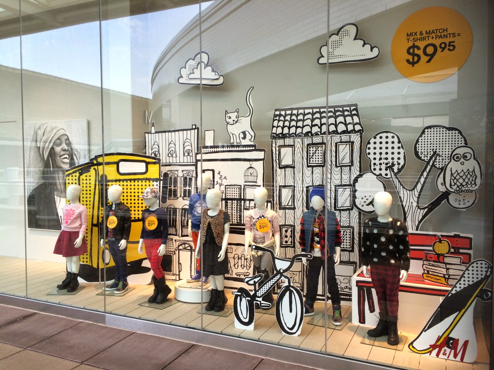
Store: H&M | Location: Oakbrook Center, Oak Brook, IL

This kid's window display from H&M was one of my favorites in terms of the graphics. Any signs, posters, or graphics used in windows can definitely set the mood for the whole display. This one was obviously geared towards a Back to School theme, which you can pick up on from the textbook and apple graphic on the right hand side, amongst other things like the skateboard, bicycle and tree. This display would definitely appeal to younger kids because it's bold and almost feels like it's a pop-up or coloring book. 
As far as the outfits, can we first just talk about how insanely cool clothes for kids are now? (Also refer to one of my previous posts on the kid's display from Zara). I mean, look at these outfits.. I did not dress like that when I was a kid. I think kid's fashion has definitely grown a lot since our days as kids. What I'm getting from this display is that kids should be well dressed too and retailers are pushing that idea. It kind of gets the youngsters to be concerned about their appearance or personal style started at an early age. Which could either be a good or bad thing.  
A lot is going on in this display, but you can definitely still pick up on what principles of design are being used. There are a lot of different proportions used with the graphics, which give the display a loud presence that immediately grabs your attention as you walk by. The window is filled with something in almost every corner so you soak in every last detail and are never looking at just nothing. Emphasis is put on the size of the graphics being used. 
This display definitely tells a story and is enticing enough for you, or someone's kid to want to go into the store.

Thursday, September 4, 2014

Petite Chic

Store: Zara | Location: Oakbrook Center, Oak Brook, IL 

This is the last window display from Zara that I loved. First of all, how cute are these little girl mannequins? Can we just take a moment to appreciate how precious and stylish they are? As you picked up from this window display, Zara also does kids clothing (which is amazing and when/if I ever have children, I am buying their clothes from here). I love how fall ready these outfits are and that they're appropriate for young girls. The looks are all very stylish, while still being comfortable enough for a young girl to move around in. Zara is definitely pushing the idea of having very well dressed kids with this display. 
On the contrary, I think this display could also be a bit discouraging because to me it feels like the mannequin with the hand out is being mean to the lone mannequin, so it might give off the impression that that's the type of customer Zara is promoting. It was probably completely unintentional and I'm just reading into the display too much, but that was just the impression I got. If I could give Zara any advice on their displays, I'd tell them to think about their placement of mannequins.