Tuesday, September 30, 2014

Cool Kid's Club

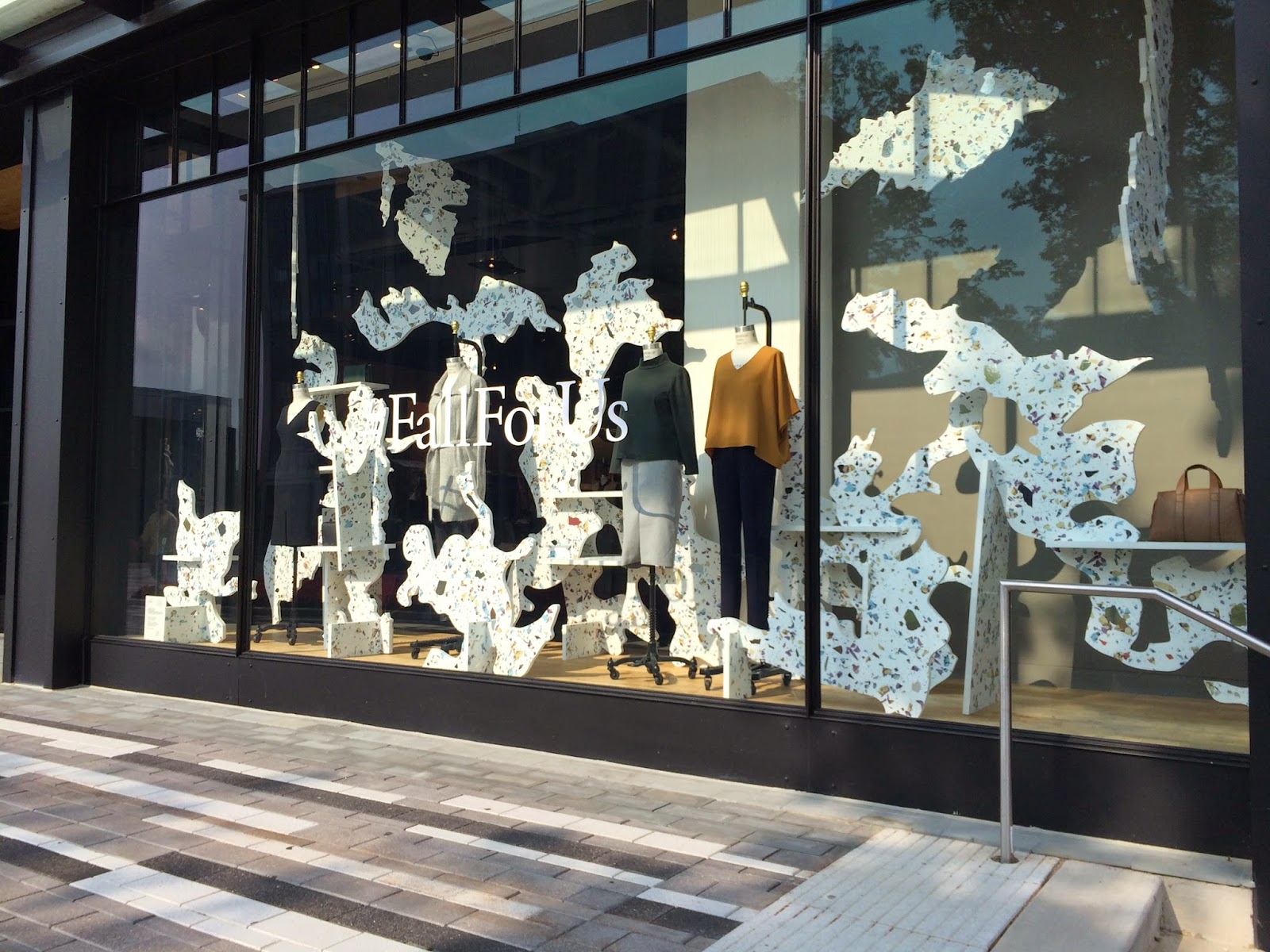
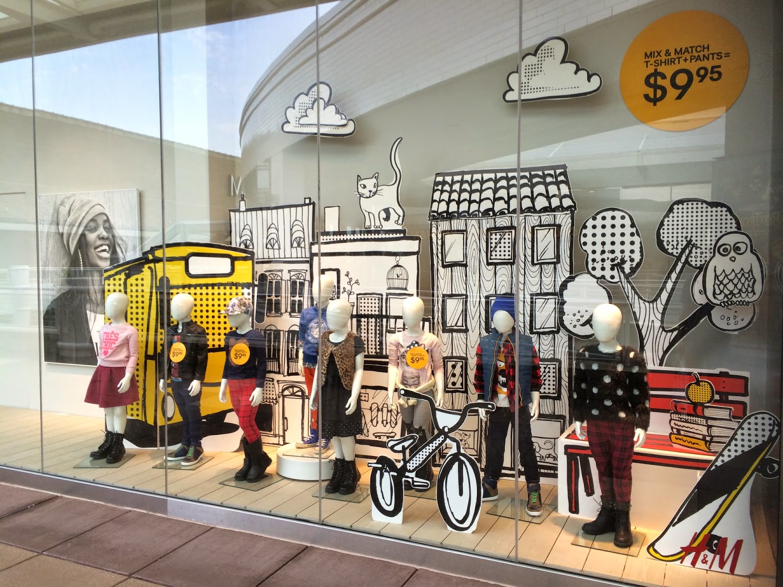
Store: H&M | Location: Oakbrook Center, Oak Brook, IL

This kid's window display from H&M was one of my favorites in terms of the graphics. Any signs, posters, or graphics used in windows can definitely set the mood for the whole display. This one was obviously geared towards a Back to School theme, which you can pick up on from the textbook and apple graphic on the right hand side, amongst other things like the skateboard, bicycle and tree. This display would definitely appeal to younger kids because it's bold and almost feels like it's a pop-up or coloring book. 
As far as the outfits, can we first just talk about how insanely cool clothes for kids are now? (Also refer to one of my previous posts on the kid's display from Zara). I mean, look at these outfits.. I did not dress like that when I was a kid. I think kid's fashion has definitely grown a lot since our days as kids. What I'm getting from this display is that kids should be well dressed too and retailers are pushing that idea. It kind of gets the youngsters to be concerned about their appearance or personal style started at an early age. Which could either be a good or bad thing.  
A lot is going on in this display, but you can definitely still pick up on what principles of design are being used. There are a lot of different proportions used with the graphics, which give the display a loud presence that immediately grabs your attention as you walk by. The window is filled with something in almost every corner so you soak in every last detail and are never looking at just nothing. Emphasis is put on the size of the graphics being used. 
This display definitely tells a story and is enticing enough for you, or someone's kid to want to go into the store.

Get in Line

Store: Nordstrom (Topshop section) | Location: Oakbrook Center, Oak Brook, IL

I love Topshop. I'm so glad that they opened one in Chicago three years ago and that they now offer Topshop at Nordstrom. Makes my life so much more convenient but also is really damaging to my wallet. I still love it nonetheless, and my wallet is just going to have to forgive me.  
Anyways, everything about this display screams fall. From the colors, fabrics, and outfit choices, this display was spot on. I loved how they aligned the mannequins in a vertical line because I feel like it makes more of a visual impact when you're looking at it rather than if they were to just have them all standing next to each other. It makes you really observe each outfit up close. I also noticed that there was a pattern in the outfits and it alternates from a denim shirt and shorts outfit to a hat and pants outfit. It just shows that they really put some thought into the display as a whole. 
The fabric choices and different patterns make every outfit look very luxe, especially the first two outfits. You definitely get that vibe from the faux fur vest and the silky blouse. The overall display also reads very street style to me because they aren't too styled. When you take a moment to look at each outfit, all the pieces are fairly basic items that anyone could easily already have in their own wardrobe. I think since the outfits are lacking accessories like jewelry,  it makes them more relatable to consumers because not everyone wants to pile on necklaces, bracelets, and rings for an everyday look. I think if the outfits were to have more jewelry on them, it would've made the overall vibe of the display more high fashion. 
As far as the principles of design go, even though this isn't an actual window, there are still some principles of design that are present. The overall display is very balanced - everything is the same height and is perfectly aligned. The vertical alignment gives this display rhythm because your eyes travel from one mannequin to the next, and so forth so there is a steady flow of visual stimulation going on. 

Saturday, September 13, 2014

Casually Feminine

Store: Nordstrom | Location: Oakbrook Center, Oak Brook, IL
I love Nordstrom. And not just for the brands and clothes they offer, but also because they always have great displays. This one was one of my favorites. From looking at the mannequins, I can tell that the type of girl they are portraying is someone who is feminine and girly but likes to keep things casual. Each outfit has a feminine quality and something that makes the look very casual. For example, the feminine characteristic from the very front mannequin is the pink jacket, and the casualness comes from the jeans. The floral ensemble is another good example because you get the girly aspect from the floral print and the casualness comes from the sweatshirt material that is used for the long sleeve top.  
This display is awesome alone, but I think what really ties everything together is the rug. Whether or not the rug was already placed there and they just strategically placed the display to compliment it, you really get that feminine vibe from the floral print of the rug, but it also makes you feel relaxed and comfortable, which is what a rug is for, and what the whole vibe of the display is saying. 
I didn't think this display was very balanced or proportioned. The placement just seems really random and doesn't flow nicely. The mannequin in the back in the white lacey top and blue shorts is almost hard to see because the mannequin in front of it in the matching floral set blocks it. I do think that the overall theme in this display is emphasized enough though so it sort of makes up for it not being as symmetrical and proportioned. 

Let's Go Camping


Store: Urban Outfitters | Location: Oakbrook Center, Oak Brook, IL
This is definitely one of the more complex displays I've seen. And by complex, all I mean is that someone (or more people) had to actually assemble this structure together. I'm assuming that this didn't take one day and one person to make. Other than that, the display as a whole is quite simple but still makes a statement. This display is the first thing that you see when you walk into the men's section and the first thing I thought of was that it looked like a cabin so I immediately got a very outdoorsy, camping vibe from it. The outfits definitely capture the camping essence and make an outdoor activity look very stylish. It almost makes me want to go camping too, but I'd still rather just stay inside in the comfort of my own home. If they weren't going for a camping vibe (but I'm pretty convinced they were), these outfits were clearly getting ready for fall.
I love this display because it shows that they had a vision and they accomplished it. It also shows how creative they are and that they are willing to step out of the box and do something different from other retailers. 
I think this display was very well proportioned and balanced. The mannequins are perfectly centered in the middle of the structure, so it makes everything symmetrical. The structure itself gives a lot of height to the display, which emphasizes that whole cabin theme and really makes you feel like you're in a cabin. With that being said, it entices customers to see what merchandise is 'inside' the structure, which gives it a nice rhythm or flow. All these principles work together to make the display unified. 

Monday, September 8, 2014

Just Hanging

Store: Urban Outfitters | Location: Oakbrook Center, Oak Brook, IL
As simple as this display is, it's still something that really got my attention. Something as easy as hanging actual product from a bar is a genius way to showcase the shape or silhouette of complex garments or items that have interesting graphics or words on them. They could easily change this table into a sweater display or a graphic tee display. The possibilities are endless and that's what I love about this display because it is so versatile that it can be a denim display now, and in a couple of weeks it can be something completely different. 
Even though this isn't an actual window display, I still think that some of the Principles of Design were present. The metal rods help to make the whole structure balanced and evenly symmetrical and there is a steady flow of denim both hanging and laid out, which emphasize that it is a denim display. 

Transitioning into Fall

Store: Urban Outfitters | Location: Oakbrook Center, Oak Brook, IL
Urban Outfitters is one of those stores where you know the mannequins are going to be in the coolest outfits and I was not surprised when I saw this display. Like the previous stores I mentioned, Urban is also clearly ready for the fall season but it isn't fall just yet so they've demonstrated three outfits that are perfect for that transition into cooler weather. Knee high socks, lightweight outerwear, and ankle boots? Hello almost-Fall! I also really liked that the main theme for these mannequins was transitioning dresses (with the exception of the floral one; it's a romper) into the upcoming fall weather.
I love in-store displays like this that get straight to the point. No fuss, no props, simply just the outfits. Sometimes that's all you need to make an impression. 
Since we just learned about the Principles of Design, I thought about which ones would apply to this display. I didn't think it was that proportioned since each mannequin is on a different level, so it doesn't make the display that balanced. Though it is balanced in the sense that the two outer mannequins both have actual legs (while the middle one does not) and they both have some sort of outerwear on, which unifies the whole display.

Thursday, September 4, 2014

Petite Chic

Store: Zara | Location: Oakbrook Center, Oak Brook, IL 

This is the last window display from Zara that I loved. First of all, how cute are these little girl mannequins? Can we just take a moment to appreciate how precious and stylish they are? As you picked up from this window display, Zara also does kids clothing (which is amazing and when/if I ever have children, I am buying their clothes from here). I love how fall ready these outfits are and that they're appropriate for young girls. The looks are all very stylish, while still being comfortable enough for a young girl to move around in. Zara is definitely pushing the idea of having very well dressed kids with this display. 
On the contrary, I think this display could also be a bit discouraging because to me it feels like the mannequin with the hand out is being mean to the lone mannequin, so it might give off the impression that that's the type of customer Zara is promoting. It was probably completely unintentional and I'm just reading into the display too much, but that was just the impression I got. If I could give Zara any advice on their displays, I'd tell them to think about their placement of mannequins.

Monochromatic Comfort

Store: Zara | Location: Oakbrook Center, Oak Brook, IL

This was another window display from Zara that I loved. I immediately fell for the monochrome black and white looks. It's very clear that the theme they were going for here was comfort. Slip ons, oversized sweaters, beanies, scarves, and leggings are the ultimate equation for comfort but Zara found a way to make it look stylish and they nailed it perfectly. I think the outfits are relatable to everyone because we all have those days when we just want to be comfy and wear oversized sweaters and leggings, so I can imagine that this would appeal to a wide range of consumers who don't want to sacrifice style for comfort. 
As I said with the previous Zara display about the placement of mannequins, I'm going to say it again with this display. I don't understand the gap between the lone mannequin and the other two mannequins. To me it's a waste of space and they could've easily fit one more mannequin in that empty spot. But regardless of that, I'm still really ecstatic about this display and I think because of the outfits, people will be drawn to have a look inside the store.

Tuesday, September 2, 2014

Neutral Ground

Store: Zara | Location: Oakbrook Center, Oak Brook, IL
Zara is one of my favorite stores so I knew I wouldn't be disappointed by their window displays. There were three windows that caught my eye and this is one of them. I love this one because the fall theme they were going for is very clear. They're definitely ready and gearing up for the coming fall season with all the layers, and if it wasn't obvious already, they're showcasing neutral shades like beige and ivory as a fall trend. Which I am not opposed to at all. Loads of fall inspiration was gained with viewing this display. 
Compared to the window display from Aritzia, which was very complex with all the shapes, this window catches the viewer's eye strictly based on the outfits. Zara's overall aesthetic is very clean cut to begin with, so having a busy window display wouldn't entirely suit them. They have to style the mannequins well in order to captivate the consumer. I also liked how they placed signs at the bottom of each mannequin that had a product list and price of what the mannequin was wearing. I thought that it could work as both an advantage and disadvantage for Zara because whatever price the consumer sees on those signs can determine whether or not they will go in the store to find that item. 
One other thing that caught my attention about this display was the placement. I was very confused on the placement of the mannequins. I thought it was strange that they grouped three of them together and left one by itself. To me it just looks like the three that are grouped together are plotting against the lone mannequin. Maybe, maybe not. Who knows.

#Fall For Us

Store: Aritzia | Location: Oakbrook Center, Oak Brook, IL
There are so many things that I love about this window. When you see it from far away, you aren't quite sure what you're looking at, which I think is both an advantage and a disadvantage. It's an advantage because the more puzzled and curious you are about it, the more likely you might be drawn to see what it is and then enter the store. On the contrary, you might not be bothered to go into the store because of how busy it looks or simply because you have no idea what you're looking at. Either way, I think it was a great use of space using all of the abstract, almost cloud like shapes because it's going to grab attention no matter what. It's a very elaborate display without it actually being too convoluted. 
Regarding the mannequins, I loved how simple the outfits were in juxtaposition with the shapes surrounding them. To me it's saying that you can stand out in the simplest outfit even in a complex environment.  
The "Fall For Us" hashtag that can be seen on the window is the social media campaign that Aritzia is using to showcase their fall collection. Users on Instagram can upload pictures of what pieces from the collection they fell for using the hashtag #FallForUs for a chance to win $2,500. Using a platform such as Instagram is such an easy and fun way to advertise, especially since social media is such a huge part of our lives. So kudos to Aritzia! Below is the video for the #FallForUs campaign, featuring a number of bloggers, actresses, models, and musicians.